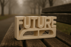
Introduction
Vlogging hasn’t just survived the last decade—it’s evolved. Through algorithm shakeups, economic shifts, and the rise of AI, creators have kept people watching by being adaptable, quick, and real. While other content formats burned out or got buried, vlogging held its ground by leaning into authenticity and tighter communities.
But 2024 isn’t business as usual. Platform algorithms are mutating. Viewer habits are shifting—less tolerance for fluff, more hunger for story and depth. AI is turning time-sucking edits into quick lifts, and audiences are flocking toward micro-niches that feel insanely specific.
For creators, this isn’t a warning—it’s a window. The ones who know when to pivot and double down will surface stronger. This year, survival isn’t the goal. It’s about knowing exactly who you are on-camera, how your content lives across platforms, and what it stands for when it shows up. Vlogging is still wide open. The rules are changing. Pay attention.
Minimalism isn’t what it used to be—and that’s a good thing. We’ve moved past stark white spaces and bland uniformity. The new wave keeps the clean look, but adds a layer of intelligence. Think clear visual hierarchy, bold typography that does more than just look nice, and design details that quietly guide a user’s eye without shouting.
It’s not about doing less—it’s about doing less, better. Brands are getting smart about where to place the user’s focus. Instead of cluttering a screen with features, they’re using white space to create breathing room, steering attention where it matters. Headers have purpose. Colors have jobs. Fonts serve function, not just flair.
Designers are letting the content do the talking, and the interface gets out of the way. That’s minimalism with maturity.
Explore more: How Minimalism Continues to Evolve in Digital Design
Maximalism Is Loud—and It’s Working
Minimalism isn’t dead, but maximalism is taking the front row in 2024. It’s messy on purpose. Think high-contrast color palettes that defy logic, patterns that clash but still somehow click, and fonts that ignore every rule in the book. This isn’t about elegance—it’s about impact. Design that screams across a scroll.
The best creators are layering visuals like collage art: neon over sepia, static glitches, hand-drawn scribbles, and text that dares you to squint. Done well, it looks intentionally chaotic—a kind of visual noise that stands out in overstimulated feeds.
This style hits hardest in arenas built for attitude. Event posters. Indie album covers. DTC brand campaigns aimed at Gen Z. If the goal is to be unforgettable in one glance, maximalism’s your ticket. Clarity takes a back seat to vibe—and that’s working just fine.
Graphic Designers Using AI as Co-Creator
In 2024, graphic designers aren’t replacing themselves with AI—they’re teaming up with it. Tools like Midjourney, DALL·E, and Adobe Firefly are now stitched into creative workflows, not just as shortcuts but as collaborative engines that scale up illustration and concept art. What used to take hours—like brainstorming layout options, visualizing mood boards, or mocking up a product shot—can now take minutes. The result? A faster pipeline, more iterations, and fewer creative roadblocks.
But speed isn’t the whole story. As AI helps push the ceiling of what’s possible, it also blurs some lines. Designers are debating where human originality ends and machine influence begins. Is prompting an image ‘creating’? When a client wants speed but you want soul, how do you find the middle ground?
Then there’s the ethical piece. AI-generated art trained on millions of real human creations opens questions about credit, authorship, and fairness—especially in branded content. Some brands are embracing the efficiency; others are wary of backlash from artists and audiences alike.
The bottom line: AI isn’t replacing graphic designers—but the ones learning to direct, filter, and elevate with it are pulling ahead. The medium may be shifting, but the need for good taste, context, and intent hasn’t changed.
Motion Graphics Aren’t Just for Video Anymore
Motion design has officially left the editing bay. It’s showing up in places it never used to live—like websites, mobile apps, and even email headers. Think moving text, pulsing buttons, swipe cues. It’s not just about looking slick; these micro-animations pull viewers in and keep them there. The strategy: grab attention without overwhelming. It’s subtle, but sticky.
Brands and creators alike are using tools like Lottie, Spline, and Framer Motion to drop in dynamic elements wherever eyeballs roam. Vloggers with personal sites or merch stores? Motion graphics are now part of the toolkit. Even quick app promos or pinned comments benefit from a touch of movement.
What used to be an afterthought for post-production is now baked into the overall experience. The lines are blurring between content and UX––and motion is the handshake that pulls users in.
Nostalgia is the New Disruption
Scrolling through vlogs in 2024 feels a bit like flipping through a dusty ‘90s zine someone scanned into a GeoCities site and warmed up with a ’70s sunset filter. The throwback aesthetic is everywhere: gritty textures, lo-fi fonts, VHS static, pastel gradients that look like they were pulled straight off an old Polaroid ad. It’s not about being retro for retro’s sake—it’s a way to feel handmade in a world drowning in clean, high-res sameness.
For creators, looking backward is a shortcut to standing out. These familiar visuals trigger emotion and trust. The nostalgic palette softens the pitch. It says, “I’ve been where you are.” But there’s a line. Leaning too hard on old vibes without a modern message risks feeling like a gimmick. It gets stale fast if there’s no substance beneath the aesthetic.
The smart move? Layer nostalgia with relevance. Use old-school design as a wrapper, but keep the core fresh—new takes, real stories, updated formats. That’s how creators are making the past feel present without getting stuck in it.
Analog Texture Meets Digital Precision
There’s a shift happening in visual branding—especially for vlog banners, intros, thumbnails, and merch—and it isn’t polished or sterile. Scanned pencil sketches, raw brush strokes, torn paper edges, and washed-out textures are being folded into sleek, modern layouts. The result? A look that feels lived-in but still sharp. It’s design that says, “I made this,” not “I downloaded this.”
This return to imperfect visuals is an answer to the overly templated, hyper-digital aesthetic that’s flooded content spaces over the last few years. People are tired of brands that look like they were made in five clicks. Instead, creators are leaning into analog elements to bring out something that feels more handmade—more them.
This style works especially well for indie vloggers and small brands looking to stand out on shelves or feeds. Think product packaging that looks like it came out of a sketchbook. Think thumbnails that mix texture with clarity—grabbing your eye without screaming. Editorial layouts, vintage magazine vibes, and analog-meets-digital collages round it out.
The tools may be digital, but the feeling is human. That’s what makes this trend stick.
Design is Getting More Inclusive—By Design
Accessibility and representation are no longer side notes—they’re front and center. Creators in 2024 are paying closer attention to how their content looks, sounds, and feels to wider, more diverse audiences. That means high-contrast visuals, legible fonts that don’t assume perfect eyesight, and layouts that work whether you’re 16 or 60. Noise and clutter are being trimmed in favor of clarity.
The shift isn’t just about checking boxes. It’s driving new kinds of visual storytelling. A more inclusive approach challenges creators to reimagine what good content looks like—beyond aesthetics, into usability. Think captions done right, color palettes readable in all lighting, and UX that doesn’t punish viewers who don’t fit a default mold.
The result? Clean, bold content that invites engagement instead of making people work for it. It’s smarter, sharper, and more human-focused—which is exactly where vlogging is headed.
Purpose-Driven Design Cuts Through the Noise
In 2024, the internet’s louder than ever. Flashy visuals, constant updates, and endless scrolls—it’s easy for content to get buried fast. That’s why purpose-driven design isn’t just a nice-to-have; it’s survival gear. Vloggers who want to stand out need to think beyond aesthetics and anchor every design move to function and story.
Top creators aren’t just picking fonts or colors to look good—they’re shaping flow, mood, and clarity. They know that visual identity needs a point of view, but also needs to work on a phone screen in five seconds flat. Good design this year balances boldness with restraint. It helps the story land without screaming for attention.
The winners? They’re the ones who know when to lean into the trend—and when to break it cleanly. They’re observant, intentional, and stubborn about usability. Design in 2024 isn’t about doing more. It’s about making what matters impossible to ignore.
 There is a specific skill involved in explaining something clearly — one that is completely separate from actually knowing the subject. Zelric Xelthorne has both. They has spent years working with technology tutorials in a hands-on capacity, and an equal amount of time figuring out how to translate that experience into writing that people with different backgrounds can actually absorb and use.
Zelric tends to approach complex subjects — Technology Tutorials, Latest Tech Innovations, Expert Insights being good examples — by starting with what the reader already knows, then building outward from there rather than dropping them in the deep end. It sounds like a small thing. In practice it makes a significant difference in whether someone finishes the article or abandons it halfway through. They is also good at knowing when to stop — a surprisingly underrated skill. Some writers bury useful information under so many caveats and qualifications that the point disappears. Zelric knows where the point is and gets there without too many detours.
The practical effect of all this is that people who read Zelric's work tend to come away actually capable of doing something with it. Not just vaguely informed — actually capable. For a writer working in technology tutorials, that is probably the best possible outcome, and it's the standard Zelric holds they's own work to.
There is a specific skill involved in explaining something clearly — one that is completely separate from actually knowing the subject. Zelric Xelthorne has both. They has spent years working with technology tutorials in a hands-on capacity, and an equal amount of time figuring out how to translate that experience into writing that people with different backgrounds can actually absorb and use.
Zelric tends to approach complex subjects — Technology Tutorials, Latest Tech Innovations, Expert Insights being good examples — by starting with what the reader already knows, then building outward from there rather than dropping them in the deep end. It sounds like a small thing. In practice it makes a significant difference in whether someone finishes the article or abandons it halfway through. They is also good at knowing when to stop — a surprisingly underrated skill. Some writers bury useful information under so many caveats and qualifications that the point disappears. Zelric knows where the point is and gets there without too many detours.
The practical effect of all this is that people who read Zelric's work tend to come away actually capable of doing something with it. Not just vaguely informed — actually capable. For a writer working in technology tutorials, that is probably the best possible outcome, and it's the standard Zelric holds they's own work to.