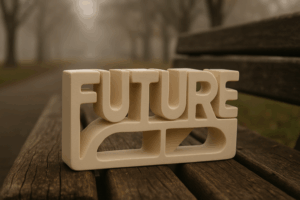
Big, Bold, and Unapologetic Fonts
Oversized type isn’t just a trend it’s a deliberate power move. In a sea of over designed visuals and fleeting digital attention, giant typography cuts through the noise. It owns space. When paired with minimalist design, it becomes the message. No distractions. No fluff. Just clarity with punch.
Designers are leaning into this scale not only for aesthetics but also for strategy. Headlines that stretch edge to edge aren’t just stylish they stop thumbs mid scroll on social, deliver authority in branding, and anchor user attention in hero sections. For brands that want to be remembered, big type says, “We’re here. No apologies.”
It’s not about shouting. It’s about precision and presence. In 2024, the type is doing more of the talking and it’s talking louder than ever.
Variable Fonts Go Mainstream
Designers need flexibility. Variable fonts give it to them.
Instead of juggling five files just to switch font weight or width, one variable font file lets you adjust those attributes on the fly. That’s a win for responsive design, especially across devices with different screen sizes. You’re not reloading assets you’re fine tuning in real time.
The performance boost is real, too. Fewer font files mean faster load times, which is big for user experience and SEO. When every millisecond counts, trimming digital fat matters.
This isn’t just a tech upgrade. It’s a design playground. Customizing movement through type weight, scaling text to draw attention, or adapting styles based on interaction all of it becomes possible.
Variable fonts are no longer experimental. They’re essential. See why in our full graphic design forecast.
Retro Typography, Rewired
Old School Styles Are Back With Purpose
Retro inspired type is making a bold return, but this time, it’s not just for nostalgia’s sake. Designers are reimagining the past to create fresh, personality driven work that feels both familiar and new.
Here’s what’s trending:
’70s Curves: Rounded serifs and bubbly letterforms bring warmth and flow to modern layouts.
’90s Grunge: Distressed textures and anti design elements offer an edge and raw authenticity.
Y2K Chrome Revival: Glossy, tech inspired typography taps into the cyber aesthetic of the early 2000s.
These vintage styles act as cultural references, but today they’re tools for storytelling with clarity and style.
Beyond Aesthetic: Why It Works
Emotional hooks: Familiar type styles spark recognition and mood.
Distinctiveness: In a sea of sans serifs, a retro face stands out.
Flexibility: When updated with modern composition, retro fonts remain fresh and contemporary.
How to Balance Old and New
Successfully using retro typography requires more than downloading a vintage font. It’s about careful integration:
Pair with modern grids and layouts to avoid a dated feel
Use retro fonts in headlines or accents, not for entire interfaces
Mix with clean sans serif bodies to maintain clarity and readability
Retro typography in 2024 is about blending character with control. It’s expressive, a little unexpected, and when used thoughtfully, highly effective.
Serif Fonts Making a Statement
Serif fonts are stepping boldly back into the design spotlight. Once seen as traditional or even outdated, they’re now being reimagined as powerful tools for creating depth, personality, and credibility in both print and digital design.
Why the Comeback?
In a digital first world where clarity and usability dominate, the warm, editorial feel of serif typefaces now offers a distinct counterbalance. With thoughtful use, serif fonts communicate trust and sophistication especially in UX centered visual experiences.
Elegance meets impact: Serif fonts bring a sense of story and gravitas to modern layouts
Editorial vibe: Longform content benefits from the timeless charm and legibility of serifs
Standing out: In a sans serif saturated market, a bold serif headline commands attention
Smart Usage in Modern Design
To avoid drifting into outdated territory, designers are blending serif fonts with clean, contemporary elements. One of the most effective strategies: pairing serif headlines with sans serif body text.
Headline hierarchy: Use serif type for titles and headers to add character and weight
Body contrast: Keep paragraphs clean and easy to read with sans serif fonts
Balance: Ensure consistent spacing, color, and alignment to maintain a cohesive look
Where Serifs Shine
Serif typefaces aren’t just for magazines or novels anymore. They’re making unforgettable appearances in:
High end brand identities
Content heavy platforms and publications
Landing pages that rely on clear messaging and user trust
The serif resurgence proves that what’s old can be new again when used with precision, they don’t just fit in, they stand out.
Type That Moves (Literally)
Animated typography is stepping off the sidelines and playing a lead role in design. Whether it’s pulsing UI copy, kinetic text in explainer videos, or scroll triggered transitions in web experiences, motion is being used as a functional design tool not just visual flair. It directs attention, sets pacing, and emphasizes key messages without adding a single word.
The best executions don’t scream. They guide. Smart motion respects the brand’s tone and knows when to pause. Designers are focusing on subtle loops, staggered reveals, and eye tracking behaviors that support the story, not overwhelm it. Accessibility remains critical animations need to respect reduced motion settings and maintain legibility at all speeds and sizes.
Getting this right is a balance game. Go too far, and your typography becomes a distraction. But nail the rhythm, and suddenly your message has movement, momentum, and staying power.
Brutalist Type Treatments
Brutalist typography isn’t here to please it’s here to provoke. Think mid weight fonts, harsh color contrast, slab serifs, and rigid monospaced layouts. It stands in stark opposition to the polished, ultra minimal design language that’s ruled for years. In 2024, it’s gaining traction again, especially in Web3, indie projects, and platforms leaning into raw digital expression.
This style feels like a protest. Against polish. Against perfection. Designers are using brutalist type to say: this isn’t about elegance it’s about impact. That said, it’s not a get out of jail free card for bad UX. The best executions bring deliberate tension, not chaos. Brutalist type works when you want to build friction: to slow a scroll, to anchor attention. It fails when it gets in the way of readability or overwhelms the rest of the layout with noise.
Used with care, it creates narrative and presence. Used poorly, it’s just shouting into a void.
Designing for Attention Spans
In a world ruled by thumb flicks and five second glances, type has to do a lot more than just look good. It has to function fast. Strategic type hierarchy isn’t optional anymore; it’s the anchor. Viewers should know exactly where to look first, second, and next. Titles punch. Subheads guide. Body text keeps the rhythm.
Mobile first layouts raise the stakes. On smaller screens, clutter kills momentum. Each line of type has to earn its space. Clear typographic rhythm line height, weight variance, spacing makes or breaks how long someone stays on a page or a post. You’re not just styling words, you’re shaping how people move through content.
This is the type of design thinking that cuts through the noise. It’s not flashy. It’s not always trendy. But in a feed scrolling world, it’s essential. Because if your typography doesn’t know where it’s going, your audience won’t either.
Keep Learning, Keep Watching
Typography in 2024 isn’t happening in a vacuum. These shifts bold fonts, moving type, variable styles are visual reflections of broader cultural rhythms. We’re seeing designers respond to faster content cycles, tighter screens, and a growing demand for personality in pixels. The type trends surfacing now aren’t design fads they’re signals of how people communicate, consume, and connect.
But let’s be clear: none of this replaces the fundamentals. Strong hierarchy, clarity, and usability still reign. The great designers don’t chase trends they use them as tools. A loud font won’t save a weak design. A slick animation can’t fix broken flow. The craft matters.
Want to go deeper? Check out the full graphic design forecast. It’s a sharp look into what’s shaping the visual landscape and why it matters to stay sharp too.